


ABBOTT LABORATORIES
ABBOTT LABORATORIES
Abbot Laboratories is the maker of a drug for manic depression called Depakote.
This project was supposed to be a tool for people who may be wondering if they have manic depression. They fill out the questionnaire, and take it to their doctor or psychiatrist to use as part of a complete medical evaluation. The project never moved forward.
CD/CW: Paula Dombrow, Photography: Cleo Sullivan
DOUBLE PAGE SPREAD

A/X ARMANI
Making basics delish.
A/X ARMANI
Making basics delish.
This ad was part of a campaign that launched Emporio Armani’s brand of basic clothing called A/X Armani.
CW: Paula Dombrow, AD: Andrea D’Aquino, Agency: Weiss, Whitten, Carroll, Stagliano

CPW Fertility Center
CPW Fertility Center
The physician who owned Central Park West Fertility Clinic hired us to create a small space print campaign to run in local media, New York Magazine and The New York Times. He told us some fun facts about his work, including that he had just gotten a 55-year-old woman pregnant. We thought it made a good ad.
CD/CW: Paula Dombrow, CD/AD: Florence Buchanan
PRINT ADS


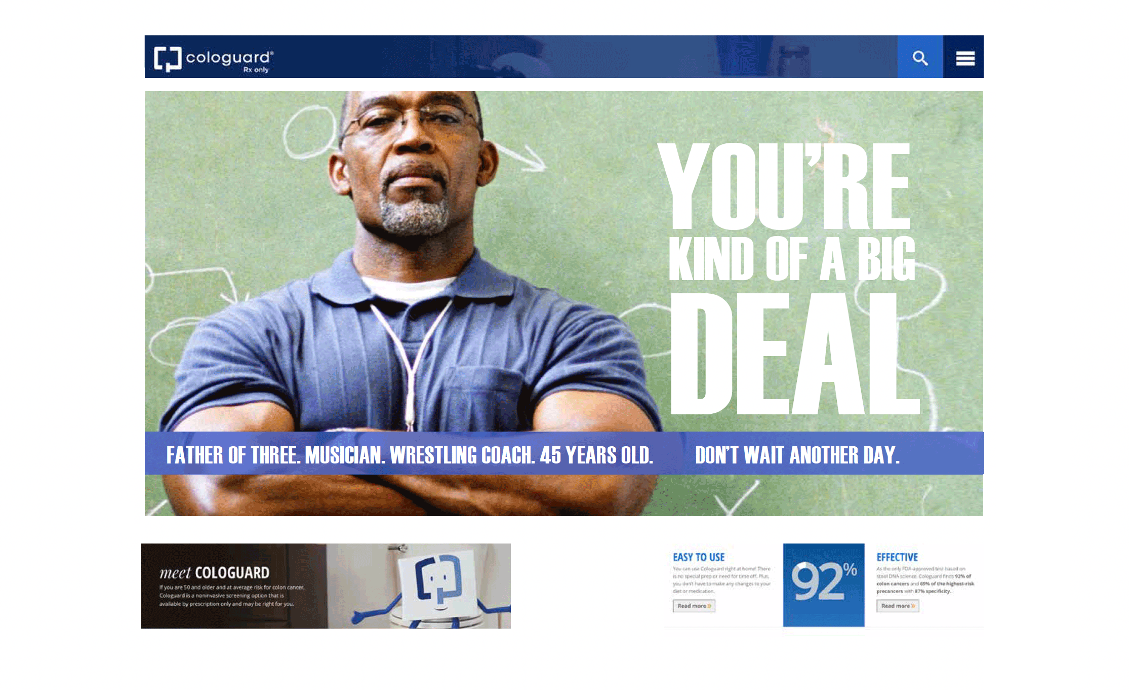
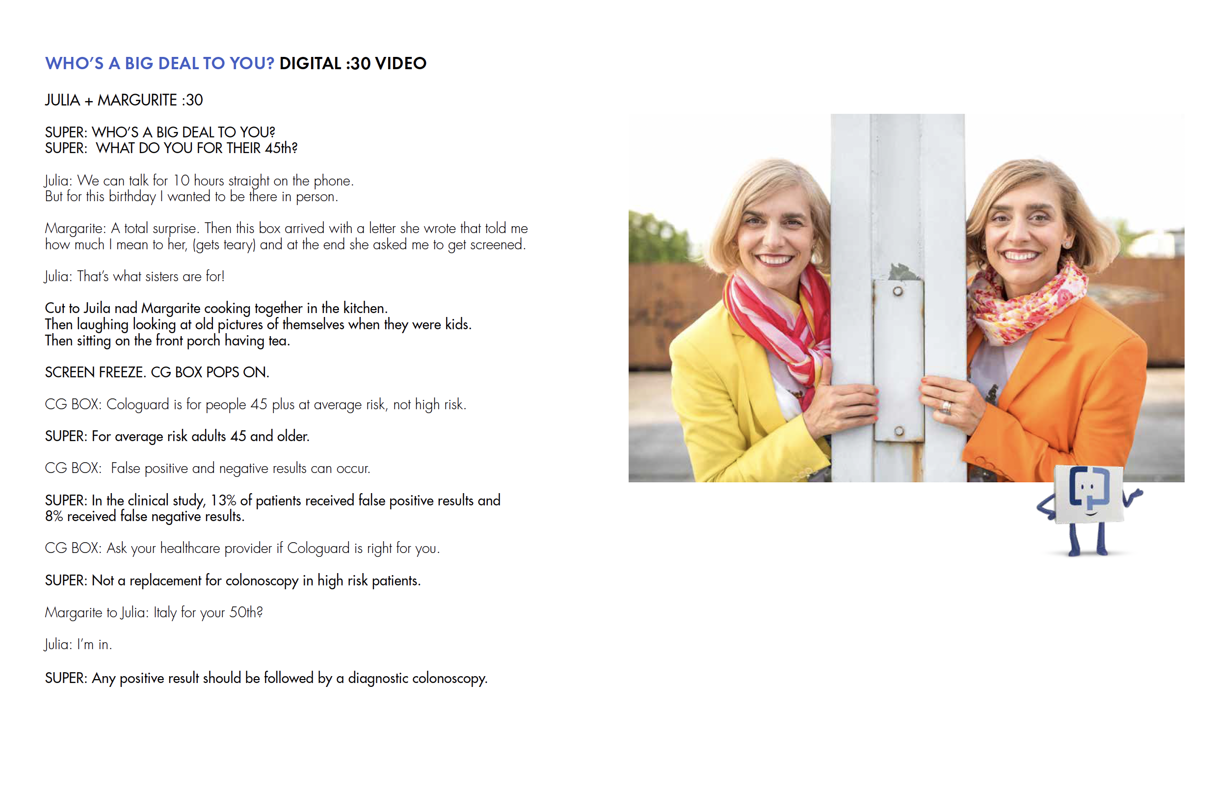
COLOGUARD | (Ann first draft)
COLOGUARD | (Ann first draft)
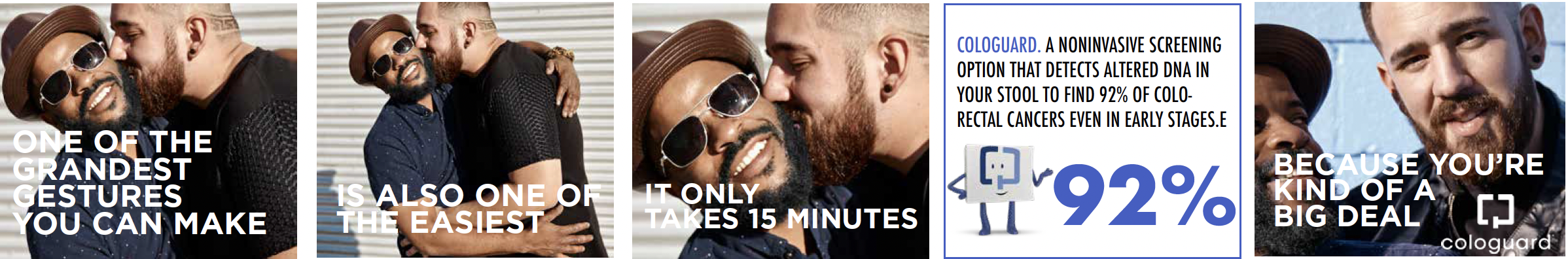
Cologuard is a non-invasive, in-home colon cancer screening option for people 45+ who are not at high risk.
The assignment was to come up with a new 360 campaign approach for Cologuard to motivate those 45+ to get screened for colon cancer, incorporating the Cologuard box character wthin the concept. (The age recommendation for colon cancer screening for people of average risk had recently been lowered from 50+ to 45+.)
We based our idea on the insight that people play important roles in the lives of their loved ones. We connected this insight to the importance of getting screened. The line, “You’re kind of a big deal”, can address both the patient directly and also become a digital activation that loved ones can send to remind those in their lives they care about to get screened.
We created an integrated campaign including a website landing page, digital banner ads, FB carousel posts, influencer messaging, digital activations, in-office HCP mirror installation, and web videos.
CD/CW: Paula Dombrow, CD/AD: Jacqueline Leak, Agency: FCB NY
LANDING PAGE

DIGITAL VIDEO


WEB ADS


“WHO’S KIND OF A BIG DEAL TO YOU?” ACTIVATION
We tap into the love and deep bonds that one person has for another. (i.e. a mother and daughter; two sisters; two best friends; husband and wife, etc.) We inspire them to do a loving act by letting them know how much they care for them by reminding them in a beautiful way to get screened for CRC as soon as they are due.
WEB ADS

PAPERLESS POST PARTNERSHIP
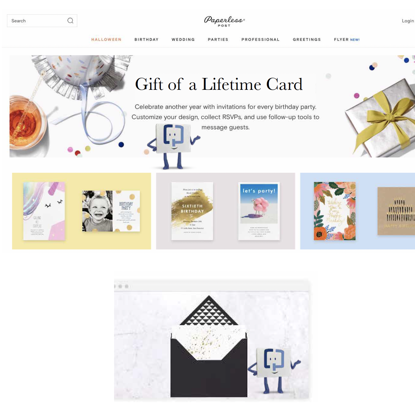
BANNERS AND ONLINE ACTIVATION RESPONDS TO YOU WHEN YOU CLICK ON “LET US KNOW” ON THE WEBSITE AND “REMIND THEM” ON BANNERS.
BOTH TAKE YOU TO A COLLABORATION WITH PAPERLESS POST GIVING YOU THREE OPTIONAL WAYS TO CONNECT WITH THE PERSON YOU WANT TO SEND THIS VERY IMPORTANT MESSAGE TO.
PAPERLESS POST LETTER/CARD.
In collaboration with PP, a letter or card can be easily customized with handwriting styles, fonts, colors, symbols, digital stationary options.
The letter gets printed on nice paper and is either delivered to that person through the mail or as a e-card through email.
PAPERLESS POST HOLIDAY E-CARDS
Right before Mother’s Day, Father’s Day, Christmas, New Year’s Day, we run banner ads and invite people to send a GIFT OF A LIFETIME E-CARD to someone who is “their big deal.”
COLOGUARD GIFT BOX
In this option, a beautifully wrapped Cologuard gift box arrives. Once opened there is a handwritten gift card that explains why this is “A GIFT OF A LIFETIME.”
The heartfelt letter inside lets the sender tell the person what a big deal they are to them and encourages them to do the COLOGUARD screening “because they are a kind of a big deal to them.” A gentle reminder sent with love, to call their doctor and ask for Cologuard to get screened.
DIGITAL VIDEO

LANDING PAGE

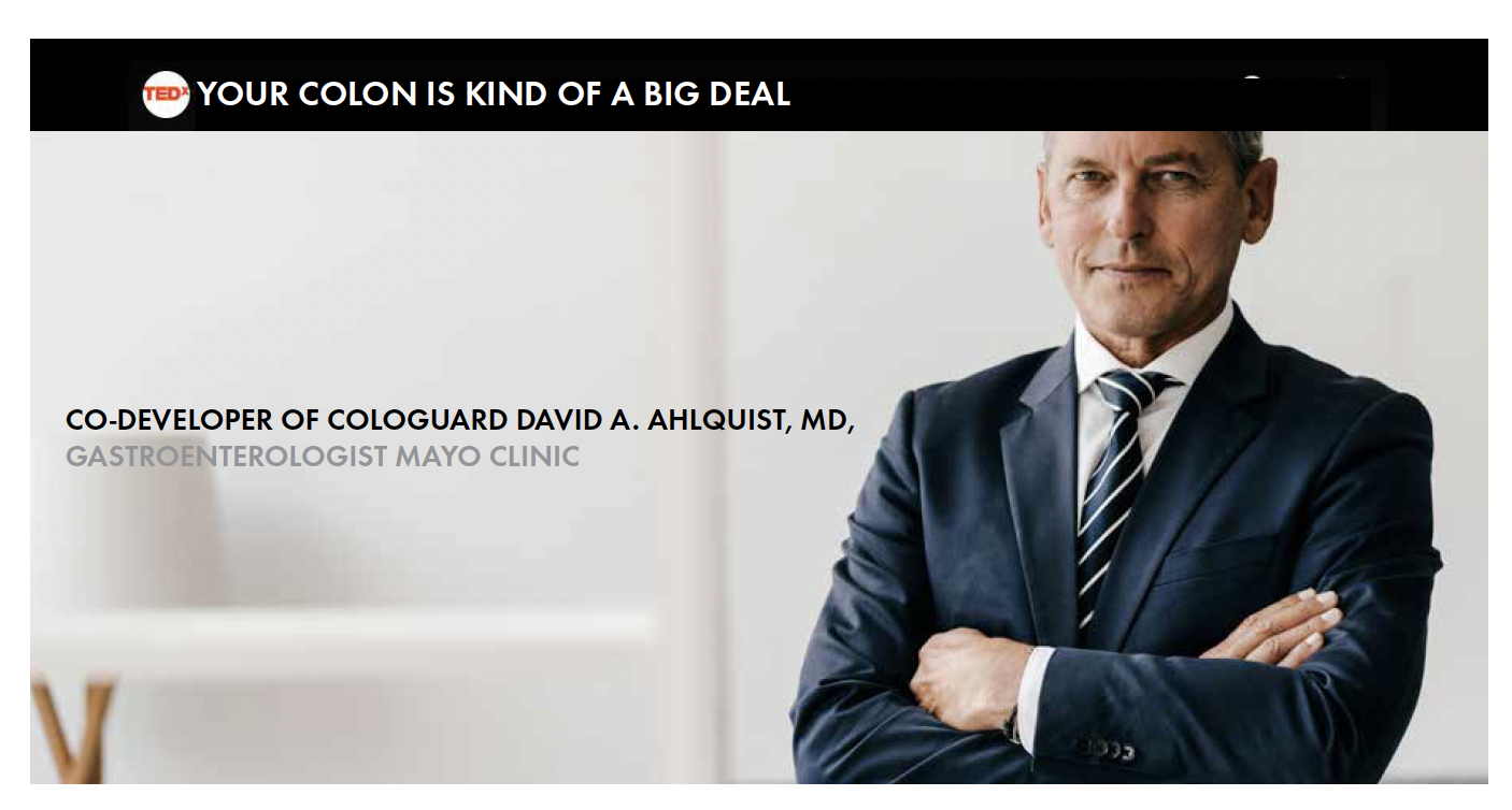
TED TALK: COLOGUARD CO-DEVELOPER, DAVID A. HALQUIST. “A BIG DEAL IN COLORECTAL CANCER”
CONTRAVE
Cravings are in your head.
CONTRAVE
Cravings are in your head.
Contrave is a prescription drug that helps people struggling with weight loss to turn off the parts of their brain that signal hunger and cravings.
The assignment was to create unbranded social media campaign concepts which educated people that being unsuccessful at weight loss is not their fault. It’s their “brain’s fault.” One idea, “Tame the Brain,” showed an illustration of a brain eating up everything in sight. Another idea, “Hungry for Control,” was based on a key insight on the brief that people who suffer with weight loss feel they have no control. Everywhere you look you are reminded of food. The concepts were given to Y&R’s digital division to develop and deploy.
CD/CW: Paula Dombrow, CD/AD: Lisa Selwitz, Agency: VMLY&R
“TAME THE BRAIN” UNBRANDED SOCIAL MEDIA CAMPAIGN
MICROSITE WEB PAGE

FACEBOOK ADS


PINTEREST ADS


FACEBOOK LIVE ADS


“HUNGRY FOR CONTROL” UNBRANDED SOCIAL MEDIA CAMPAIGN
MICROSITE WEB PAGE

FACEBOOK & INSTAGRAM ADS


ESCADA
How we got retailers to notice us.
ESCADA
How we got retailers to notice us.
Escada created a line of lower cost, everyday wear called Apriori. It had no name recognition with retailers or consumers. They wanted to get attention and get into retailers' stores and women's closets. With tongue firmly planted in cheek, we created a series of ads that suggested the entire world of all every day products were ripping off Apriori designs. Even Slinky.
CW: Paula Dombrow, AD: Ellen Steinberg, Photographers: Inez Van Lamsweerde & Vinoodh Matadin, Agency: Weiss, Whitten, Carroll, Stagliano
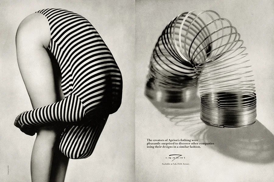
Headline: The creators of Apriori clothing were pleasantly surprised to discover other companies using their designs in a similar fashion.
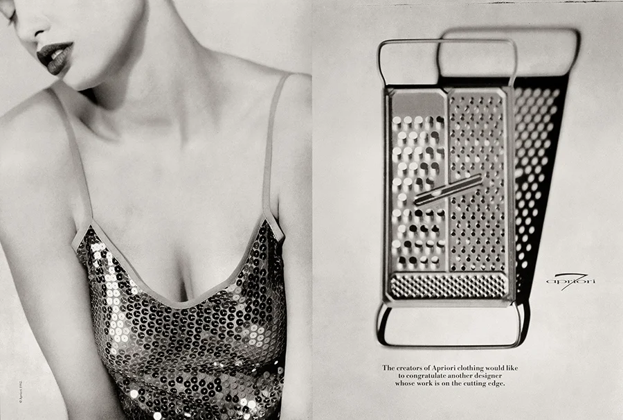
Headline: The creators of Apriori clothing would like to congratulate another designer whose work is on the cutting edge.
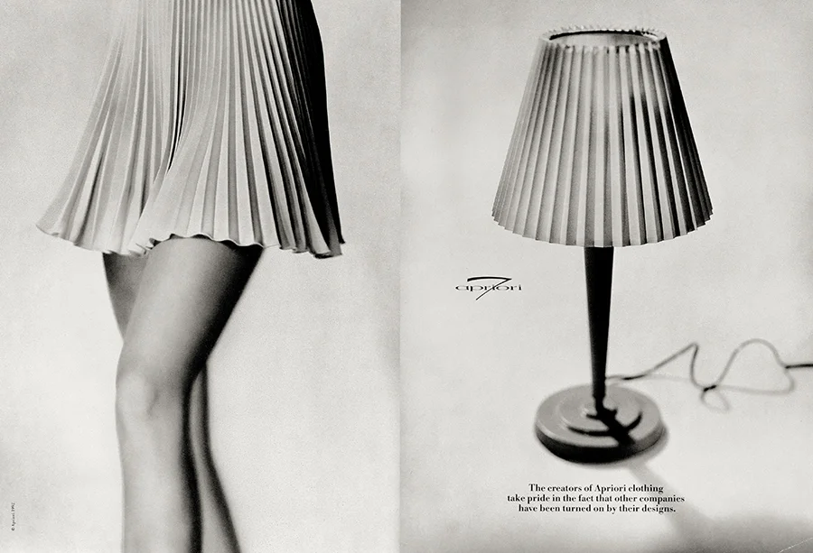
Headline: The creators of Apriori clothing take pride in the fact that other companies have been turned on by their designs.
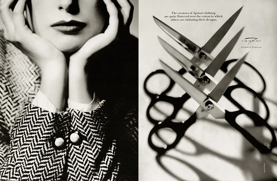
Headline: The creators of Apriori clothing are quite flattered over the extent to which others are imitating their designs.
FESTINA
FESTINA
One day a director in L.A. called me. I’m not sure who gave him my name. He was shooting three films for a luxury Italian watch starring Gerard Butler in a week. The locations were locked. And there was one script that was still not written.
The assignment was to write an internal monologue for Gerard Butler who would be on camera at a house in Malibu looking out at the ocean. The script tag line was already written: “Time to Live.” I wrote a bunch of scripts and sent them over. I got a call a few days later from the director who was on his way over to Gerard’s house where they were going to record the VO for one of my scripts. He said Gerard had an issue and wanted to talk to the writer. He asked if I could get on a quick call with Gerard, so I did. Gerard was very respectful. He said he liked the script a lot except for one line he didn’t feel was masculine enough. I suggested a couple of other lines. He liked one. Here’s how the film turned out. It ran all over Europe, with subtitles.
CD/CW: Paula Dombrow, Director: Sinisha Nisevic
FESTINA COMMERICAL :30 TV
GLENFIDDICH
Smooth beyond comparison.
GLENFIDDICH
Smooth beyond comparison.
William Grant & Sons tasked us with communicating their centuries-old, single malt scotch is smooth beyond comparison. We used a bit of high-brow hyperbole creating a series of print ads with exaggerated stories of people who go to extremes to achieve a level of smoothness that doesn't measure up as revealed by the Glenfiddich drinker.
CW: Paula Dombrow, AD: Ann Lemon, Photographer: Nadav Kander, Agency: Chiat/Day


Savor Health
Savor Health
Savor Health was a start-up when we got hired to work on it. They needed a brand story, some web page headlines, a logo, and a color palette for their new website to help raise investment capital.
Savor Health has a knowledge-based personalized technology platform and a team of oncology credentialed registered dietitians that deliver customized nutritional meals to people with cancer, as well as caregiver support. They wanted a logo that conveyed personalization and nutritional support. We came up with the idea of an abstract thumbprint which includes a symbolic apple inside of it.
CD/CW: Paula Dombrow, Designer: Lily McCullough, Agency: Tomorro
LOGO/TAG LOCK UP

COLOR PALETTE

LOGO/COLOR PALETTE IN USE

Savor Health
Savor Health
Savor Health was a start-up when we got hired to work on it. They needed a brand story, some web page headlines, a logo, and a color palette for their new website to help raise investment capital.
Savor Health has a knowledge-based personalized technology platform and a team of oncology credentialed registered dietitians that deliver customized nutritional meals to people with cancer, as well as caregiver support. They wanted a logo that conveyed personalization and nutritional support. We came up with the idea of an abstract thumbprint which includes a symbolic apple inside of it.
CD/CW: Paula Dombrow, Designer: Lily McCullough, Agency: Tomorro
LOGO/TAG LOCK UP

COLOR PALETTE

LOGO/COLOR PALETTE IN USE

SOPHIE McLEAN
SOPHIE McLEAN
Sophie McLean was the most effective leader at Landmark Education, a global transformational enterprise. She was the leader of leaders there for many years where she led transformational courses to over 80,000 people worldwide. She is a known figure among graduates of Landmark programs. Sophie left Landmark Education launching her own business of one-on-one courses, webinars, and speaking engagements.
The assignment was to create a new website and a brand for Sophie around her courses which are all about achieving awareness. Agency, Truth Beauty Now, directed the effort, coming up with the idea of using photography of Sophie and details of her at home and on the beach as a visual direction for the website and her new book cover.
Truth Beauty Now came up with “Access to Awareness” as the catch phrase for all her programs, and created a logo, color palette, a new website and a book cover design. TBN hired fashion photographer, Cleo Sullivan. The idea was for Cleo to photograph Sophie capturing her innate elegance and her authenticity at her home (where her one-on-one courses are held) and at the beach (a setting where the story of her book takes place). The idea was also to use quotes from Sophie to break up the content which we edited and also provided some headlines and subheads to help it all flow.
CD/CW: Paula Dombrow, Web Site and Book Cover Design: Jacqueline Leak, Photographer: Cleo Sullivan, Agency: Truth Beauty Now
WEBSITE DESIGN + LOGO + COURSE PROGRAM NAME + BOOK COVER DESIGN + CONTENT EDITING


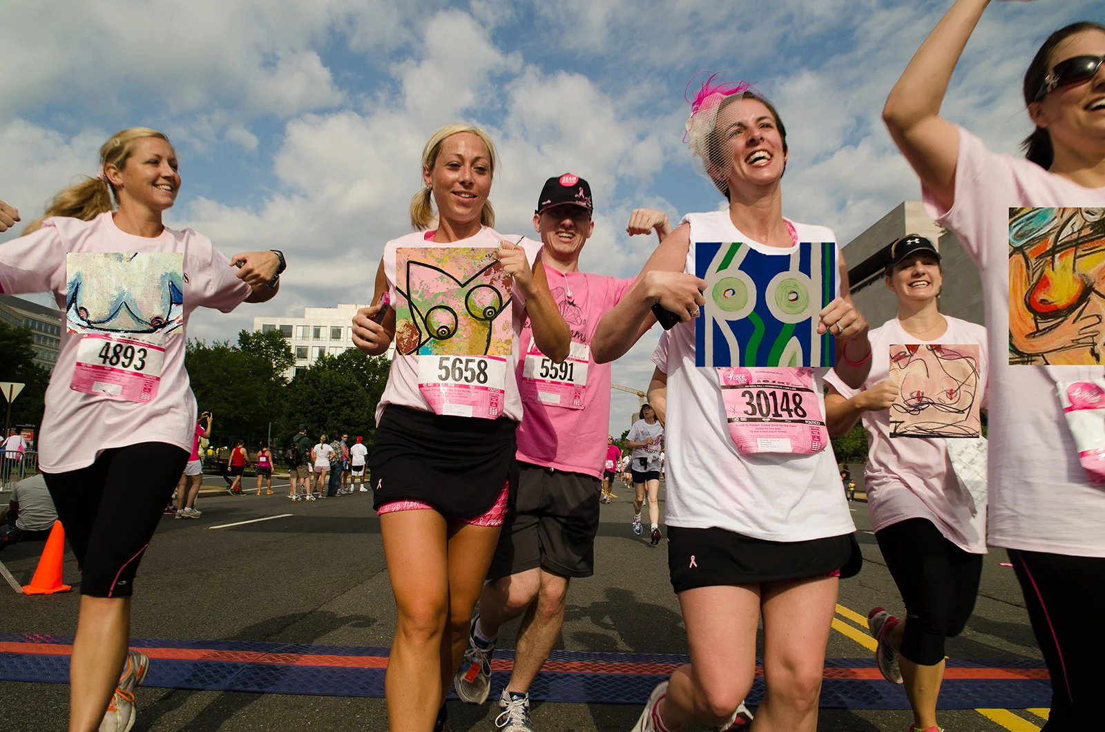
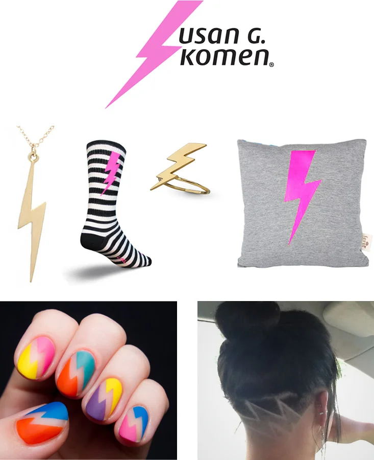
SUSAN G. KOMEN
SUSAN G. KOMEN
Susan G. Komen’s image had become part of the “old guard". The pink ribbon had become faded with overuse and the race for the cure had lost its momentum. In this pitch we were tasked with rebranding Susan G. Komen, including their logo and their communications to bring them into the “new guard”.
In a world where the media exploits breasts, we put the power back where it belongs, with the women who own them. We came up with the idea “Flaunt for the Fight” creating a new movement where everyone can bare their breasts together in the form of customized breast art they proudly wear.
To give the movement another jolt forward, we evolved the pink ribbon into a pink lighting bolt.
CW: Paula Dombrow, AD: Dawn McCarthy, Agency: Possible
MOBILE APP + ART
The app creates abstract artwork of each user’s breasts. The artwork is printed on race t-shirts at the Komen events. Customized merchandize using the original artwork is sold via the app and an on-line auction to raise money for the cure. Personalized artwork becomes Facebook badges.

FACEBOOK BADGES
YOUTUBE CHANNEL
A Youtube channel, “BoobTube”, features famous female comedians doing self-breast exams.

SHOPPING BAGS
Instructional illustrated shopping bags exhibit how to do a self-breast exam.


LOGO + MERCHANDIZING
Merchandizing and trending opportunities of breast art and the lightning bolt.
URBAN OUTFITTERS
The eternal quest of the teenager.
URBAN OUTFITTERS
The eternal quest of the teenager.
WALMART
Stronger together with the vaccine roll-out.
WALMART
Stronger together with the vaccine roll-out.
Consumers felt distrust and fear when the government was first distributing the COVID-19 vaccine. Walmart was less established as a wellness destination than its closest competitors.
The assignment was to come up with a big idea in the form of a multi-channel campaign to reassure Americans it was safe to get their COVID-19 vaccine at any Walmart. The strategy was to leverage their history of giving community immunizations (flu, pneumonia, and shingles), letting customers know that Walmart pharmacists were ready and capable of safely delivering the vaccine to them, their families, and their community.
The campaign idea chosen to move forward was one I created – "Getting Stronger Together Starts Here." I wrote the initial manifesto to sell the idea internally and then to Walmart clients. We then worked with the Saatchi team to create and execute the initial launch. I wrote/produced animated videos for the Walmart website and the initial social media launch for FB, IG, Youtube, and Pandora Radio. I also helped develop other 360 campaign ideas and activations, including broadcast TV, OOH, in-store and live events.
CW: Paula Dombrow, AD: Michael Cohen, Agency: Saatchi Wellness.
WEBSITE VIDEO
One of three videos that ran on the Walmart website.
Social Media kick-off with Pharmacists

Pandora Radio Produced

WALMART – PANDORA RADIO :30
“Stronger Together”
MUSIC: Optimistic, uplifting
VO: Let's get stronger together.
The COVID-19 vaccines are on the way.
I'm ready, along with thousands of other Walmart pharmacists, to safely administer them for free, with or without insurance.
I’ve been helping my community stay strong for years, delivering flu and pneumonia vaccines, and giving COVID-19 tests through the pandemic.
The more people we help stay healthy, the more resilient we are as a community.
Getting stronger together starts here.
Talk to your Walmart pharmacist today.
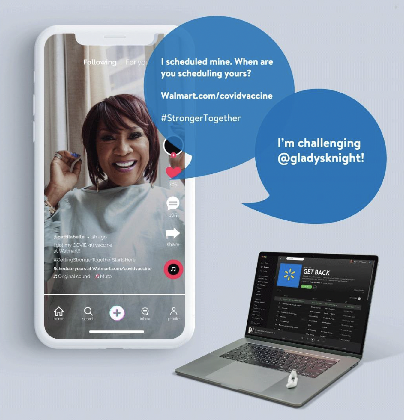
Social Activation: CELEBRITY CHALLENGE
Celebrity TikTok Challenge with Patti Labelle
SOCIAL ACTIVATION: CELeB PARENTS
Celebrities bringing parents to Walmart to get the COVID-19 Vaccine.

SOCIAL ACTIVATION: THE “SELFLESS SELFIE”
People post selfies with stickers when they get their Covid Vaccine at Walmart

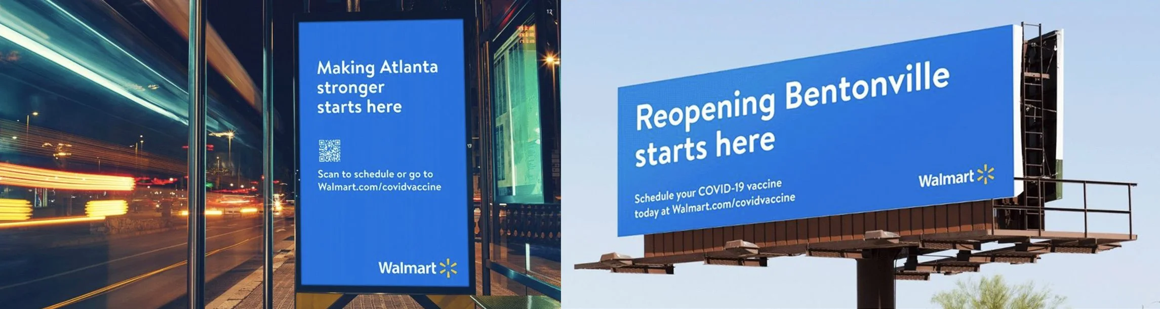
IN-STORE

LOCAL OOH
WEBSITE AND IN-STORE AMPLIFCATION: “Stories of Strength”

OUTDOOR AMPLIFICATION: “Stories of Strength”

Projection mapping “Stories of Strength” on stores, and featuring them at local Drive-In Movies.
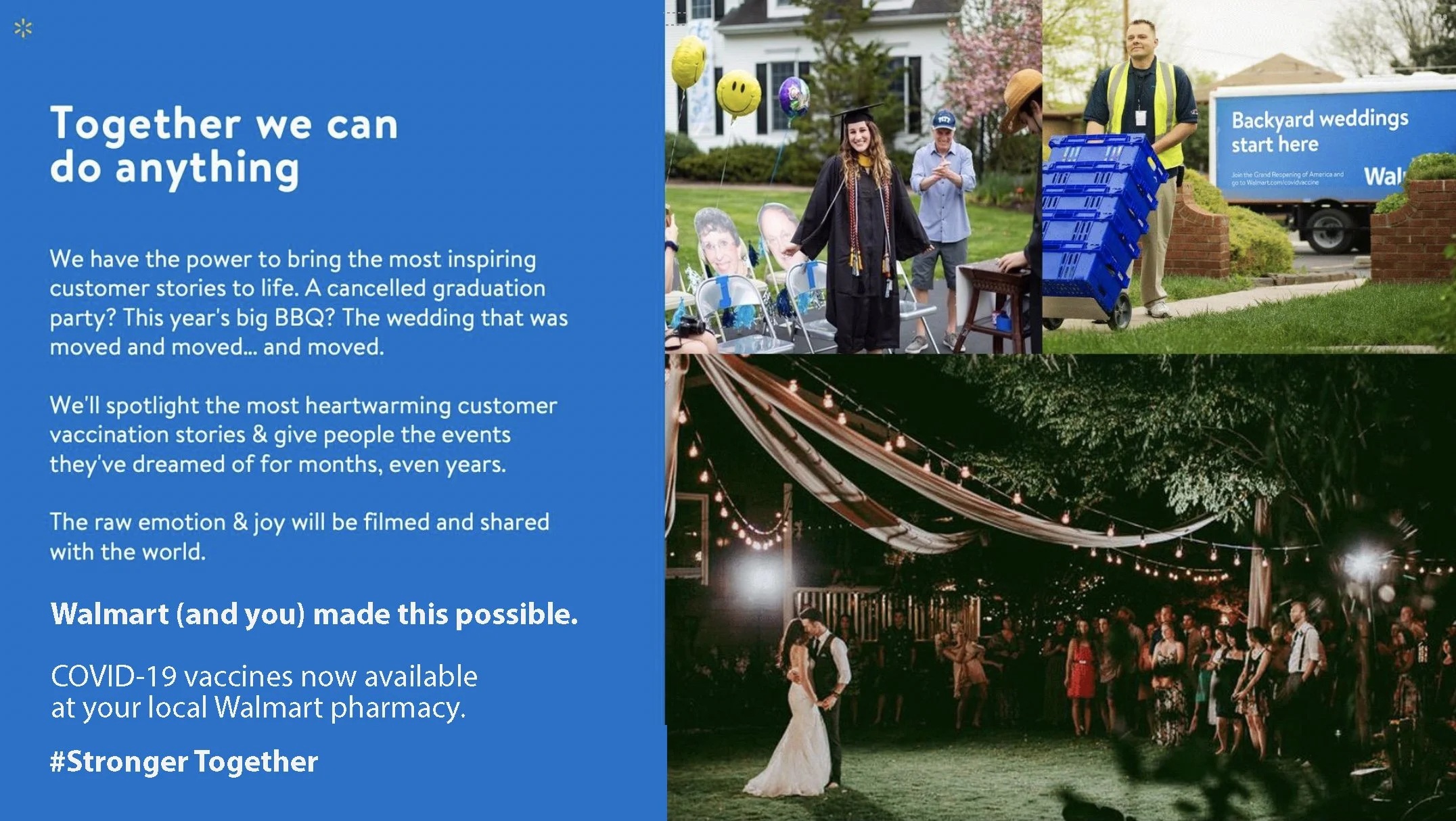
Celebrate coming back together “Stronger Together”.